(←) Work / Branding
Nudgd
- Category
- Branding
- Year
- 2026
- Client
- Nudgd
- Created in
- Figma, Adobe Illustrator, PowerPoint, Canva
- Deliverables
- Brand manual, logo, PowerPoint templates, SoMe templates
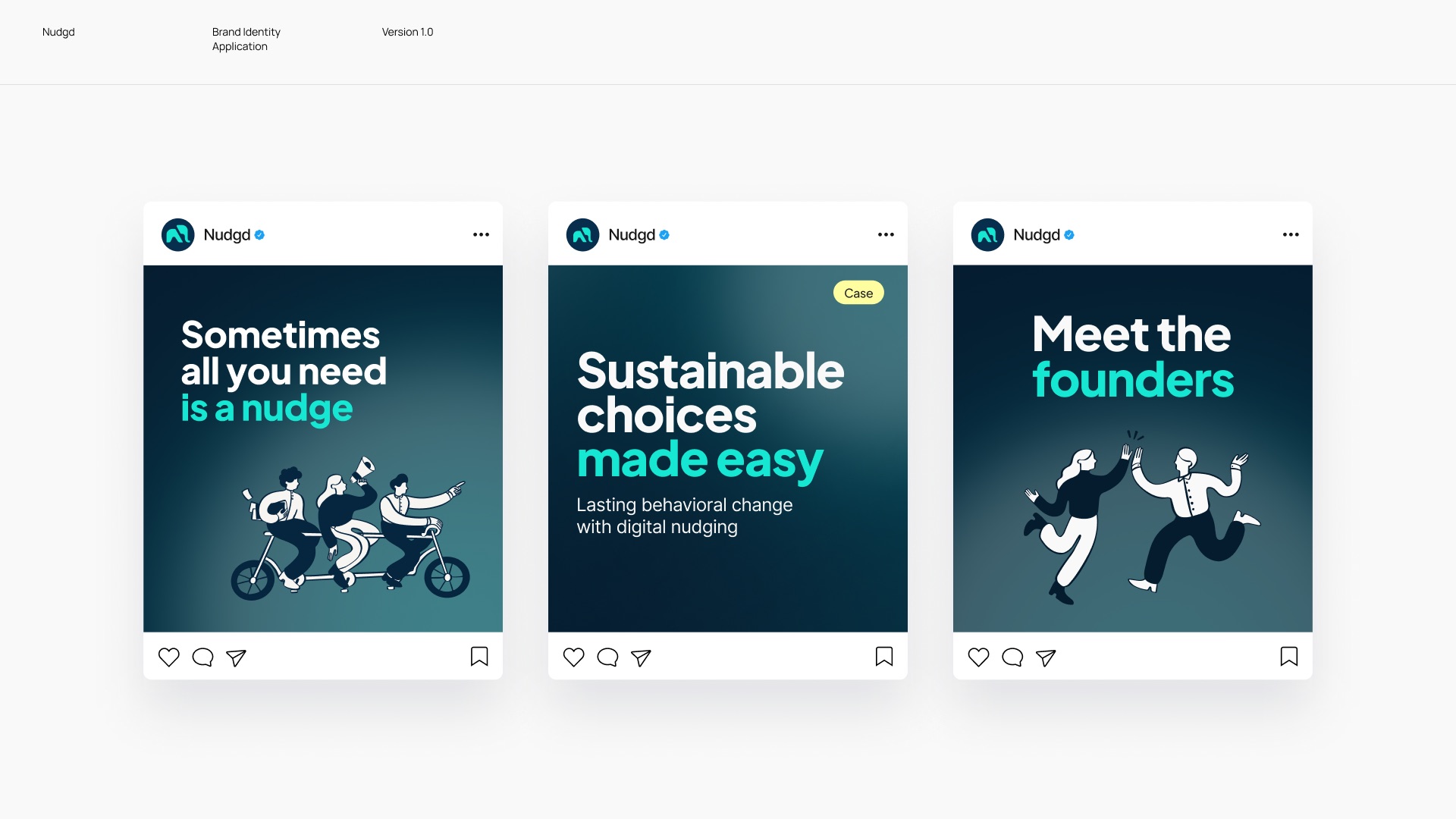
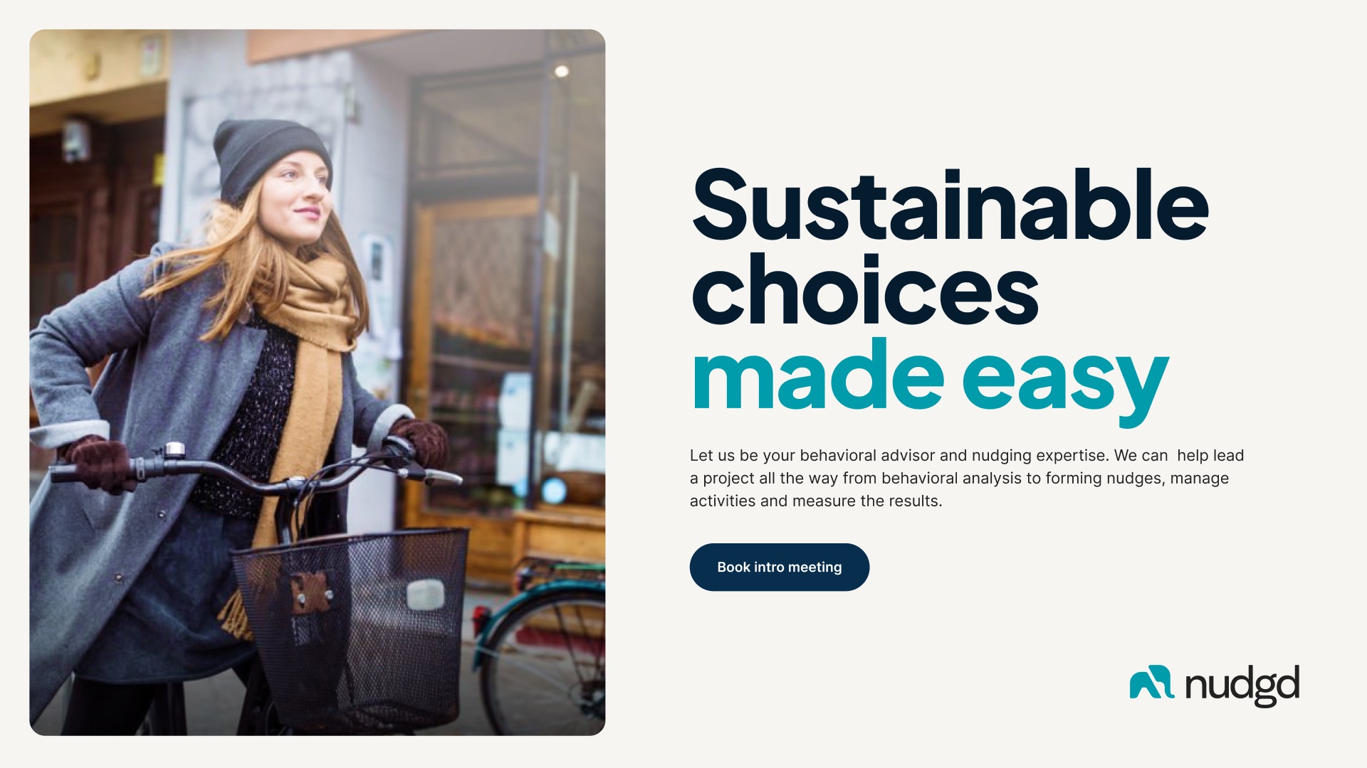
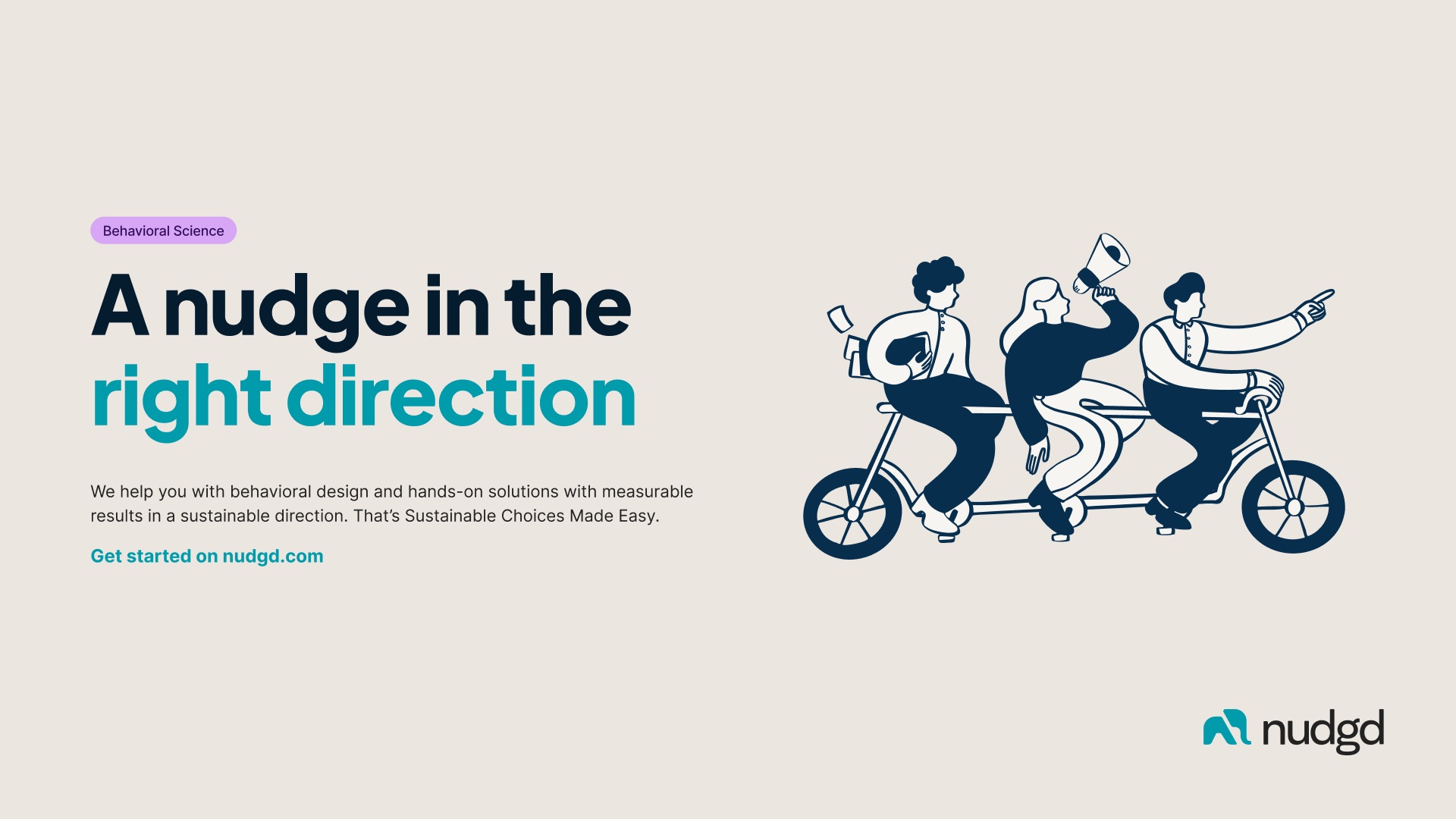
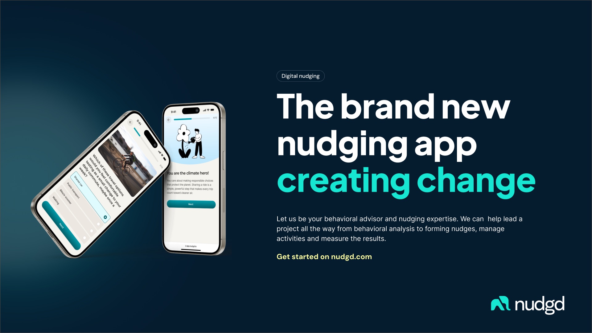
An evolved brand identity for Nudgd, with a brand manual, logo, and social media and presentation templates.
Re-branding of Nudgd
Creation of a new brand identity for Nudgd with brand manual, social media templates and presentation material.
The challenge
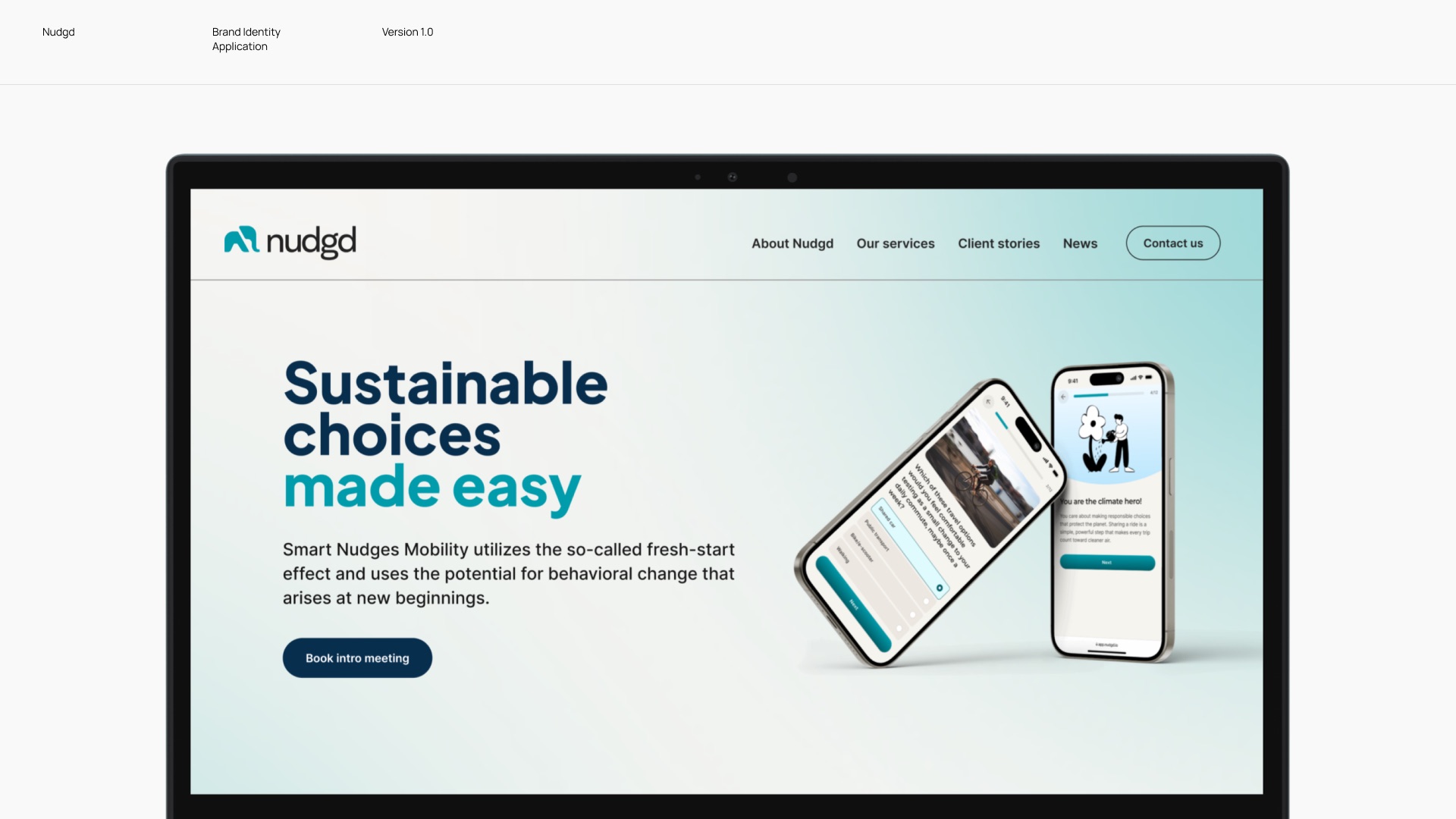
Nudgd helps companies and municipalities encourage employees and citizens to make more sustainable choices through nudging and design. Rather than instructing people what to do, Nudgd uses behavioral insights and thoughtful design to gently guide decision-making.
However, as both design standards and digital products have evolved, Nudgd’s brand and web presence had become outdated. They needed an update that aligned with modern technology and expectations, while better reflecting their position as a data-driven, SaaS-oriented company. The goal was to create a visual identity that feels modern, friendly and tech-forward, while also meeting WCAG 2.0 AA accessibility standards.
The approach
The project began with a collaborative workshop with the Nudgd team to define and clarify the brand. One of the key insights was the need to position Nudgd as more SaaS-oriented and tech-forward. As Nudgd relies heavily on behavioral science and data-driven insights, it was important to balance a professional and credible tone with a friendly and approachable feel.
From this, a clear brand mission was established: “To make sustainable choices easy and create measurable impact on climate change.” This was supported by three core brand values: Smart, Easy and Impact.
The solution
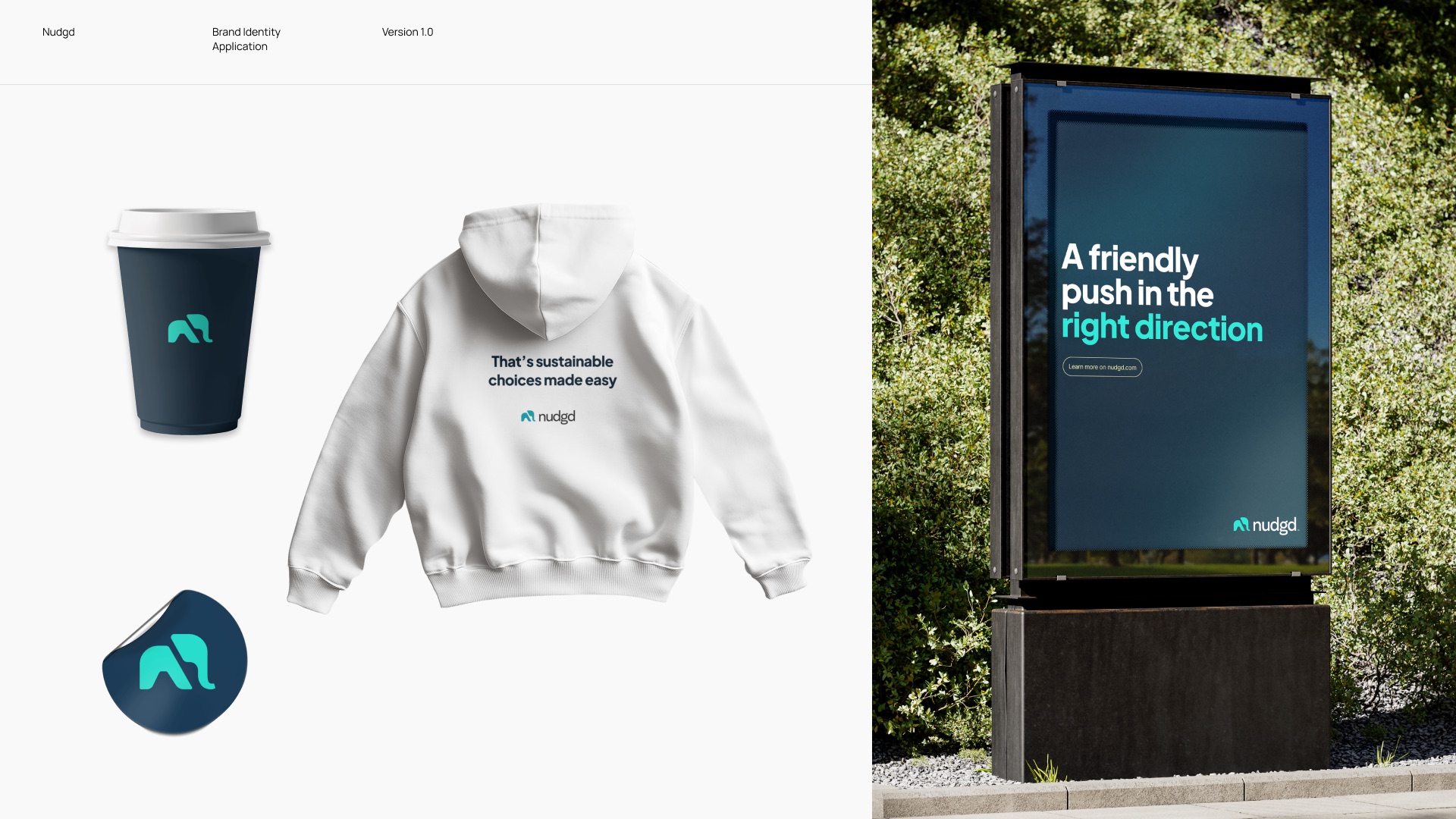
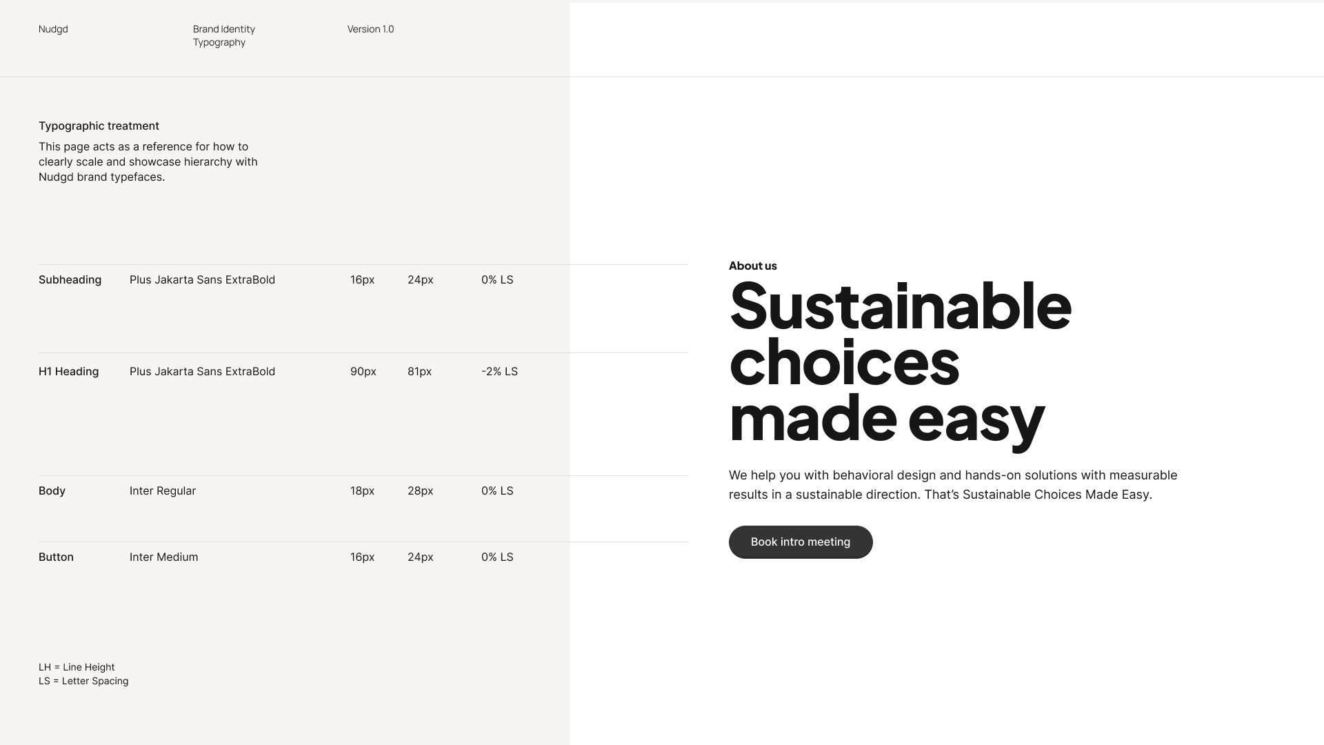
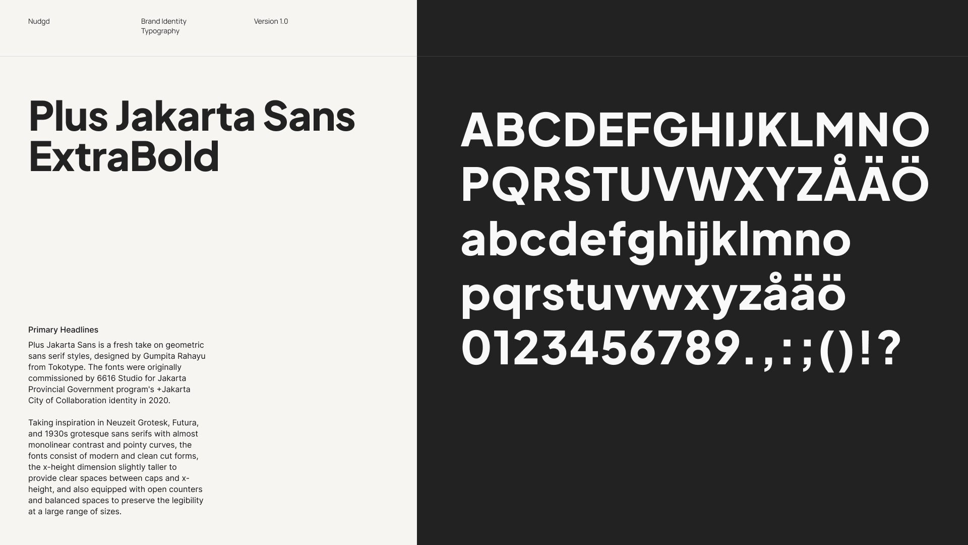
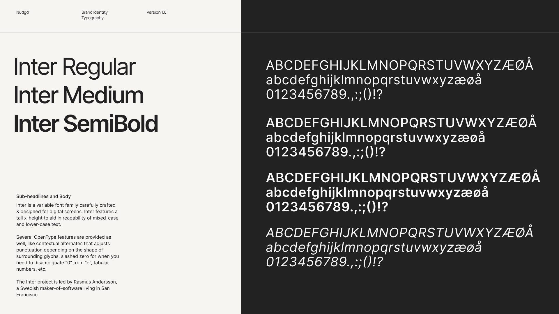
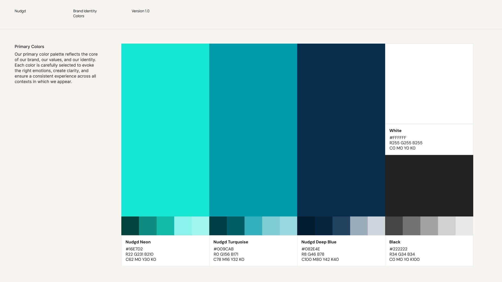
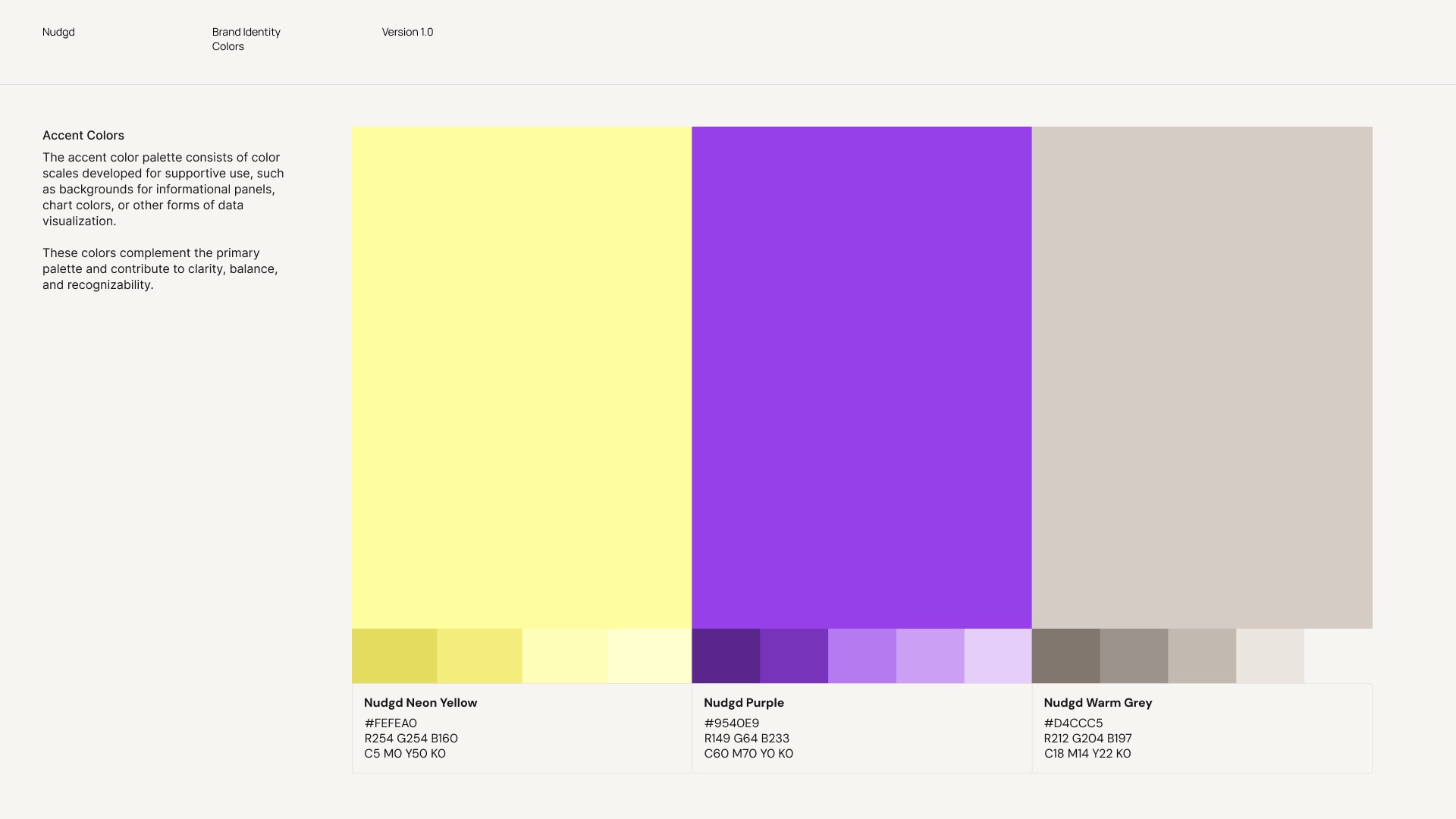
Rather than a complete rebrand, the goal was to evolve Nudgd’s identity while maintaining recognizability. The existing color palette was refined into a more dynamic and modern system with stronger contrast, complemented by new purple and yellow accent colors that work seamlessly with the core blue and turquoise. To support consistent communication, a set of social media and presentation templates was developed in line with the updated brand.
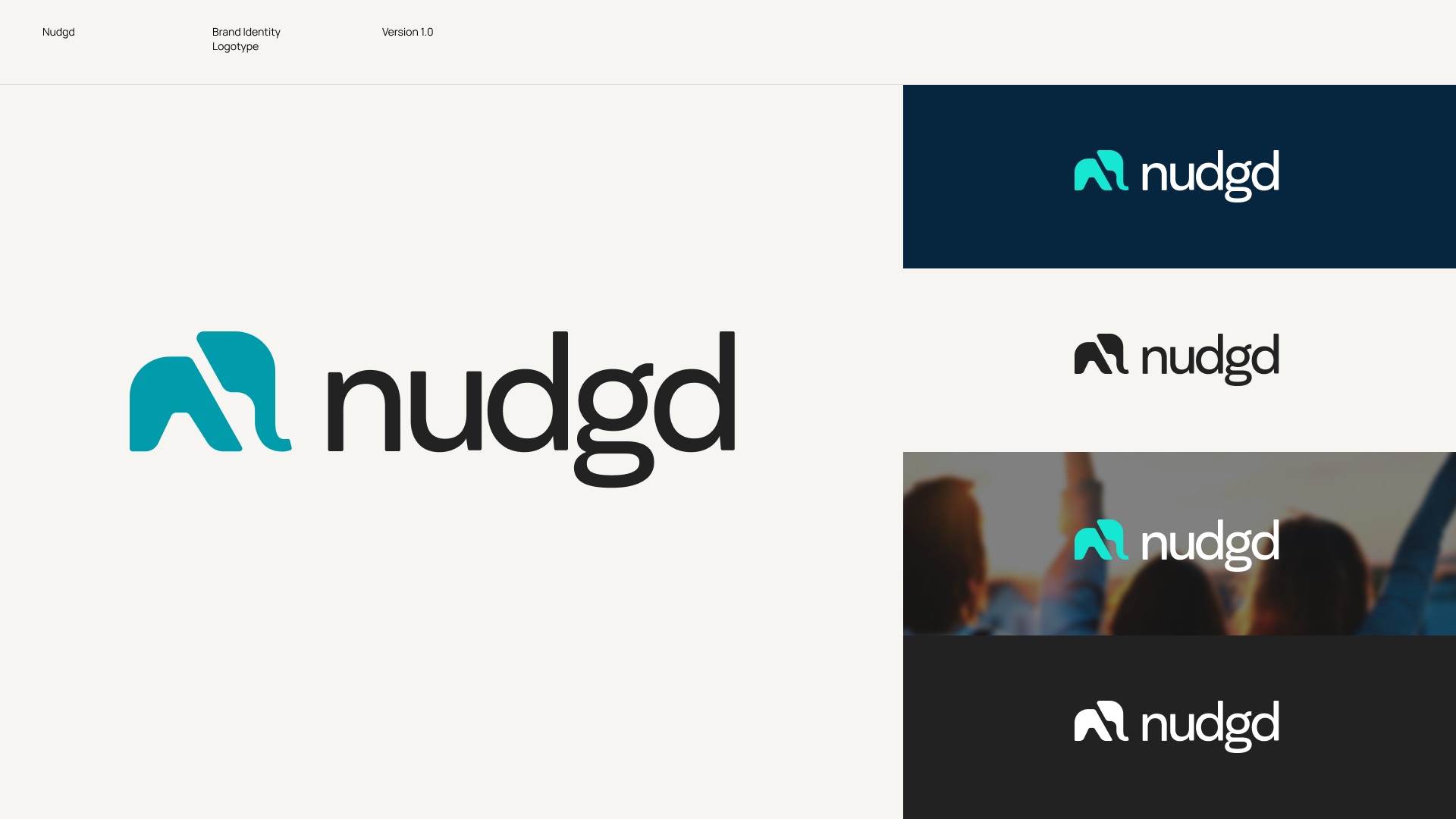
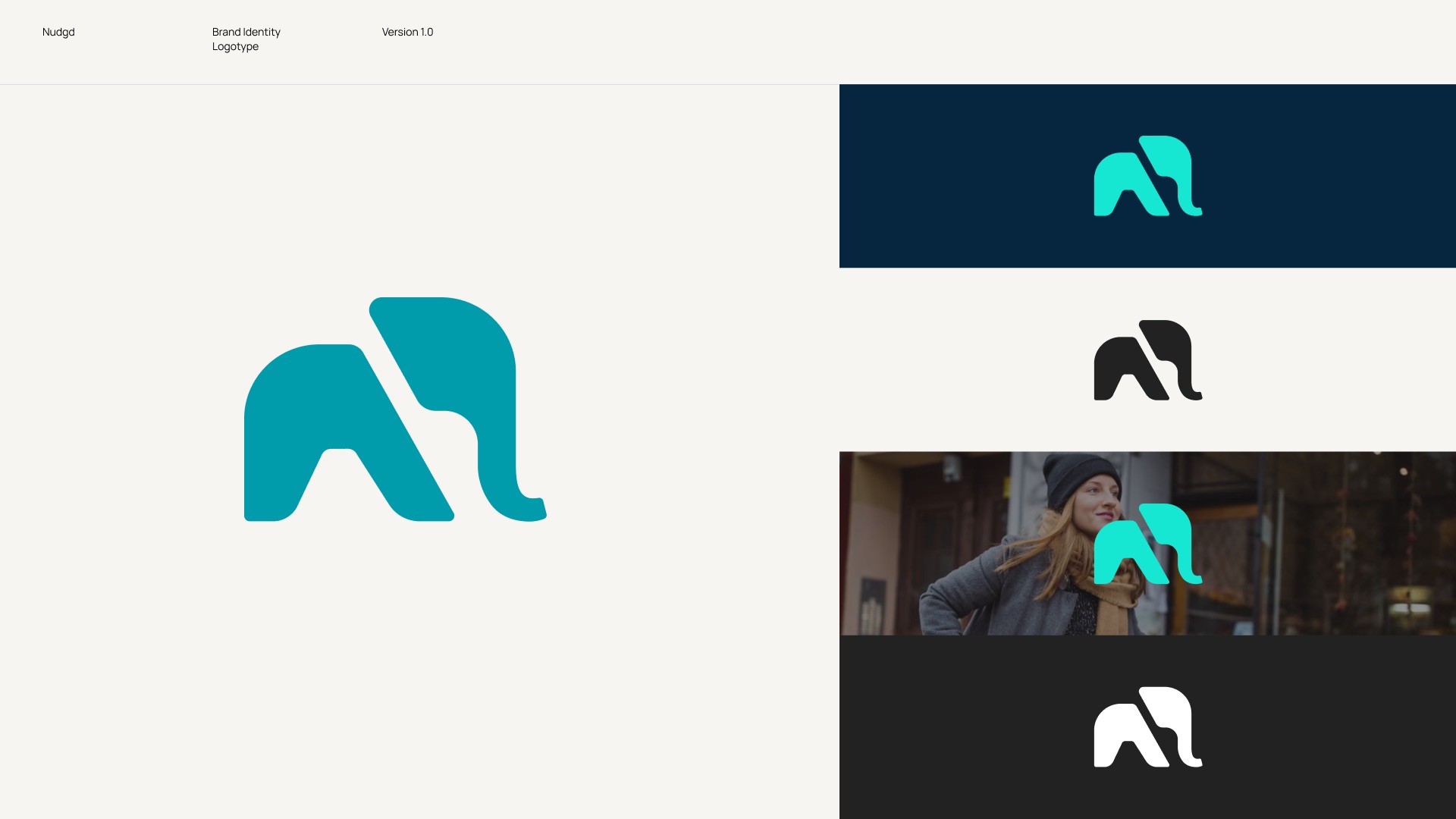
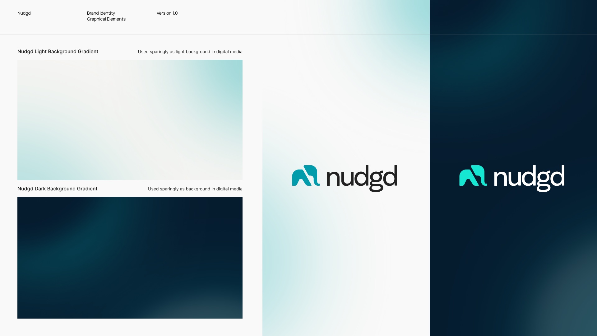
The logotype was simplified to improve clarity and scalability with the typography. As a subtle brand detail, the elephant’s trunk was redesigned to point outward, as a visual interpretation of a “nudge”.